Visual Identities: How to build yours
A visual identity is made up of different graphic elements. Logo. Social media icon. Graphic device. Colour palette. Typography. Photography. Illustrations. Iconography. Put together with care, they can project your brand’s unique personality. In this blog, we look at how to piece them together effectively.
Brand strategy meets creativity
The starting point of creating an effective visual identity is having a clear brand strategy in place that articulates who you are and what you stand for. This is your Purpose, Proposition and Personality. Together they form the crux of the creative brief and are the guiding compass against which all visual identity elements are critiqued.
The importance of your logo
https://www.theteam.co.uk/blog/long-live-logos/
A logo is the cherry on top of the brand cake, but not the be all and end all, as you should be able to place your thumb over it and still recognise the brand. Key decisions include whether you want a wordmark (like Ebay), or a wordmark together with a symbol (like Nike). Or you could choose a literal logo, which is popular across the charity sector (like WWF’s panda). Or perhaps an abstract logo (like Mitsubishi).
Remember, different shapes and symbols signify different things. The Amazon and FedEx logos both include arrows for example, which is representative of what they do. What’s most important these days is that you have a version that will also work when used as an icon across digital platforms, which is why there is a trend for 2D rather than 3D logo design. You should also consider whether you want a dynamic logo that can evolve like Google.
The importance of a graphic device
https://www.theteam.co.uk/blog/rise-graphic-device/
It is increasingly popular to build a visual identity around a graphic device that can be used across marketing communications to aid brand recognition. HSBC’s interlocking arrows and Vodaphone’s speech bubble are good examples of this, both of which are taken from their logos. I would argue that identities with graphic devices are stronger. They are a central component of The Team’s visual identity solutions, just like Rightmove’s house icon, which can revolve into an arrow and a heart to communicate their proposition – ‘Find your happy’.
Rightmove: Rightmove’s house icon revolves into an arrow and a heart to communicate their proposition – ‘Find your happy’.
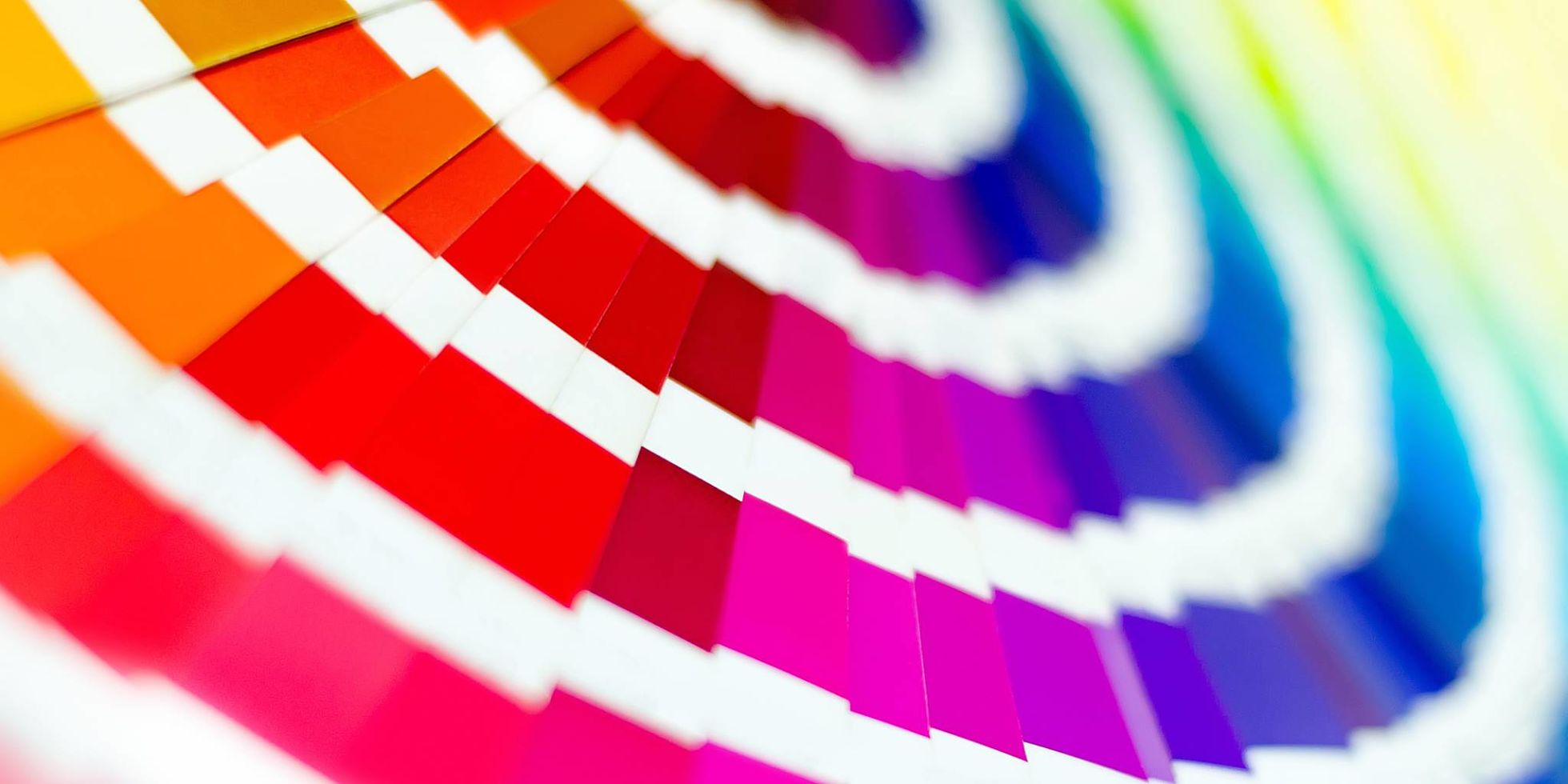
The importance of your colour palette
https://www.theteam.co.uk/blog/colour-me-happy-accessible-design/
It’s great when a brand is recognised for a core colour, like Cadbury’s purple and Easyjet’s orange. But most visual identities have a primary and secondary palette of contrasting shades, with a blend of darker and brighter tones and ‘pop-colours’ for stand-out. Colours are often chosen using a colour wheel, and by considering what different colours signify as well as colour accessibility standards. Yellow is bright and optimistic but difficult for making text readable. Red signifies danger, so it is used a lot in the charity sector for emergency aid. Colours also come in-and-out of fashion like teal (Deliveroo) and hot salmon pink (from Airbnb to Equally Ours). Make sure you have Pantone, CMYK and HEX references for printing and digital purposes.
The importance of typography
https://www.theteam.co.uk/blog/typography-in-the-mind-accessible-design/
I don’t think many people outside of the design industry realise the attention that goes into choosing a typeface. This is where considering how well the typeface reflects the brand personality is critical. Rightmove chose Effra for its blend of open, friendly curves and authoritative corners to reflect its Friendly Exert personality.
Sans Serif typefaces (those without extending features, such as Helvetica) are considered more contemporary than more traditional Serif typefaces (those with extending features, like Times New Roman). Upper case is considered more shouty, and lower case more friendly. You can choose from a zillion different fonts from font houses, adapt them to make them more unique, like Parkinson’s UK, or create your own as Macmillan has done. You may also need a headline font for stand-out and a body copy font for longer text. Accessibility is king, so make sure you’re up to date with current standards.
The importance of photography
https://www.theteam.co.uk/blog/using-photography-to-capture-emotive-stories-accessible-design/
Photography can be expensive, so the first thing to consider is how you’ll source it long-term. You could rely on stock photography, or commission shoots instead. It is also important to consider how the photography you choose compliments any moving image content. Portraits are good for building a human connection, and reportage for showing real life. Product shots are used to sell and show finer details.
You should also consider how to make your photography uniquely yours: by adding an effect, or filter, or considering how they work alongside your graphic device. With Brain Research UK awe-inspiring brain scans are laid over photography to create a sense of positive energy. With Crimestoppers, a fly-on-the-wall style crops out the faces of ‘Stoppers’ for anonymity, together with imagery that is suggestive of a crime. These are combined with the graphic device of 45-degree angles, inspired by stop signs.

Brain Research UK: Awe-inspiring brain scans are laid over photography to create a sense of positive energy.
The importance of illustrations & iconography
https://www.theteam.co.uk/blog/illustration-that-connects-and-reflects-society-accessible-design/
It is harder to think of visual identities that are heavily reliant on illustration for recognition, and this is often a get out of jail card when it comes to brand consistency: “You can use any style, as long as you apply our colours”. Cop-out! Mind’s squiggles obviously have a clear relationship to their logo, and NatWest’s illustrations clearly aid their customer journey.
In a world where we predominantly interact with brands through digital channels, having clear icon styles is now critical. Rightmove and Scope’s icons use the same characteristics as their signature typefaces. Rightmove icons have a mix of straight and curved corners to reflect their personality, while Scope’s are placed inside shapes created from their typeface – Hargreaves – to aid accessibility. They also have an illustration style they can replicate in-house that celebrates clarity and diversity.
Scope: The holding shapes, borne out of the lettershapes, are an integral part of the visual identity.
The importance of target audiences & research
When creating your visual identity, keep your target audience segments firmly front of mind. We often pin pen portraits of them on the walls of our studio to ensure they are not forgotten. You might also want to test creative concepts via research. In this case, I prefer mood boards or advertising concepts to test the concept and sense of direction over the design detail.
The importance of brand architecture
Brand architecture is simply the jargon used to describe how you present your range of initiatives in relation to your master brand. There are different models you can follow such as unified, a branded house, family of brand and endorsed. But what’s important is that you have agreed clear architecture before you embark on creating a visual identity to avoid unnecessary sub-brands, or ‘logo-soup’ as I’ve heard it called.
The importance of ‘process’
And, last but by no means least, we come to process – sometimes the key ingredient to success. There is the more traditional back-and-forth approach where an agency presents, then develops concepts based on a creative brief and the client’s feedback. Or, there is the more innovative ‘design sprint’, where you unite the creative team over consecutive days, or weeks, to create the solution iteratively. The latter is often more time and budget efficient.
If you need help defining or refreshing your visual identity, get in touch. We love a good design sprint!