Crimestoppers
Creating emotional connection with a new brand purpose and visual identity

Challenge
To raise awareness of its status as an independent charity, Crimestoppers decided to embark on a brand refresh to build brand understanding, to create an emotional connection with key audiences, and to build a compelling case for support.
Crimestoppers believe everyone has the right to feel safe from crime. The charity’s purpose is to give people the power to speak up and stop crime, 100% anonymously. The charity’s unique service has high brand awareness, however there is a misconception that they are part of the police, TV programme Crimewatch, or funded by Government.
They also needed to evolve to engage their ‘Supporters’ (the volunteers and donors who make the service possible) as well as their ‘Stoppers’ (the people who use the service) under one design system.
Approach
• An in-depth audit showed that the existing brand had a ‘split personality’ that didn’t reflect the internal culture.
• We drew on our understanding of human psychology to create two co-ideas of what the brand could stand for in the future.
• By studying fundamental human beliefs and values, we were able to identify the core belief that should sit at the heart of the brand’s messaging.
Strategy
Initially, we conducted primary research by visiting Crimestoppers services to understand more about how the charity operated.
Following an in-depth brand audit, we co-created two ideas of what the brand could stand for that would bring together the needs of the ‘Stoppers’ and ‘Supporters’ into one, coherent brand identity.
Research conducted with all Crimestoppers’ key audiences helped establish a new brand strategy, including personality and tone of voice, and the brand purpose: ‘Everyone has the right to feel safe from crime, wherever they live’.
Outcomes
Work
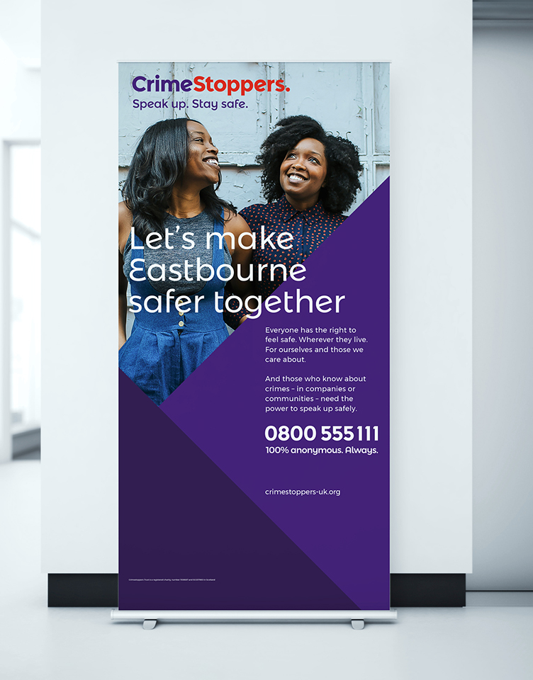
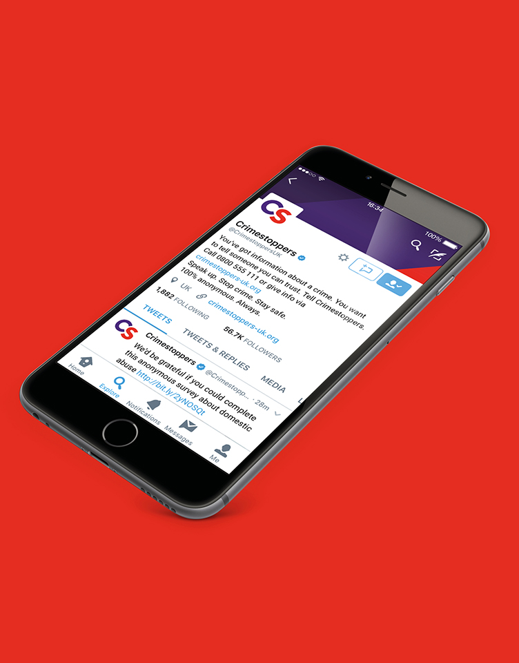
We created a flexible identity system built around the personality of a ‘Community Champion’ – caring and inclusive when communicating to Supporters, trustworthy and determined when communicating to Stoppers.
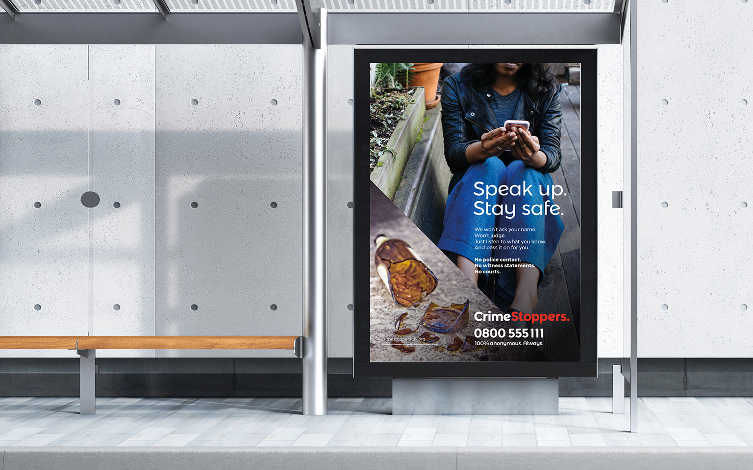
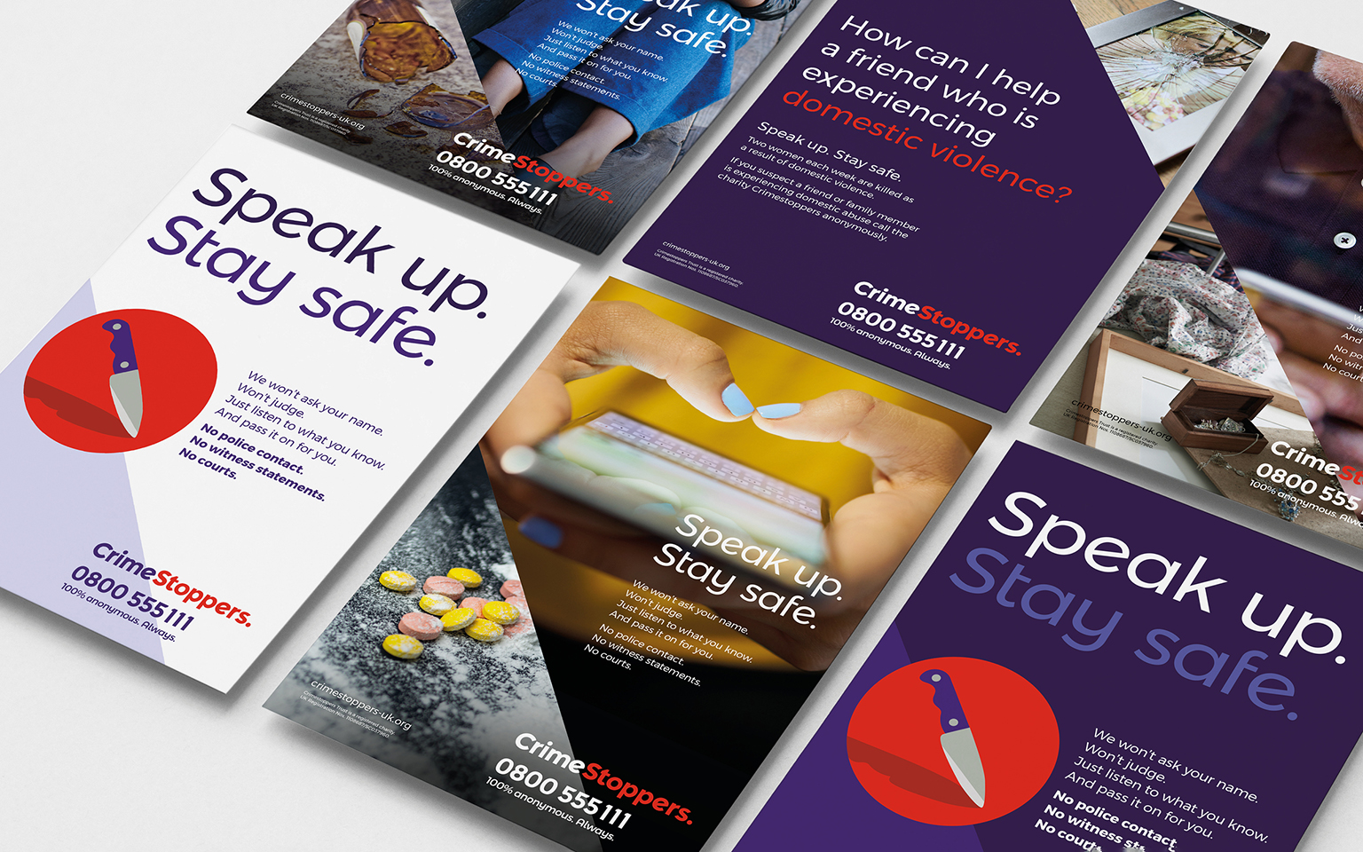
The identity and logotype are inspired by road signs and built around 45-degree angles – up for ‘speak up’ and down for ‘stop crime’. The new tone of voice is made up of short, punchy, sentences: “We won’t ask your name. Won’t judge. No courts.”
Brand communications required clarity and consistency, so the new brand identity tells stories for Supporters and Stoppers through photography featuring people in everyday environments. An illustration style was created for when photography isn’t appropriate and uses simple geometric shapes with rounded corners to soften the look and feel.
The red has been retained to reflect Crimestoppers’ heritage, and a complementary purple means the palette avoids using black or ‘police’ blue. Secondary colours of teal and mustard create a more vibrant and energetic feel.
Mark Hallas, Chief Executive at CrimestoppersWe have worked hard with The Team to refresh our brand and are delighted with the results. We have done this in a way that we feel will make more people call us with information about crimes in their community or their workplace. Additionally, the refreshed brand provides the right platform to better engage supporters both in the public and commercial arenas. While we work closely with the police, we are an independent charity and need to ensure the public knows that.
More Case Studies

IBM Consulting
Repositioning and creating brand value for IBM
CLAPA
Redefining the voice of the UK cleft community