Rightmove
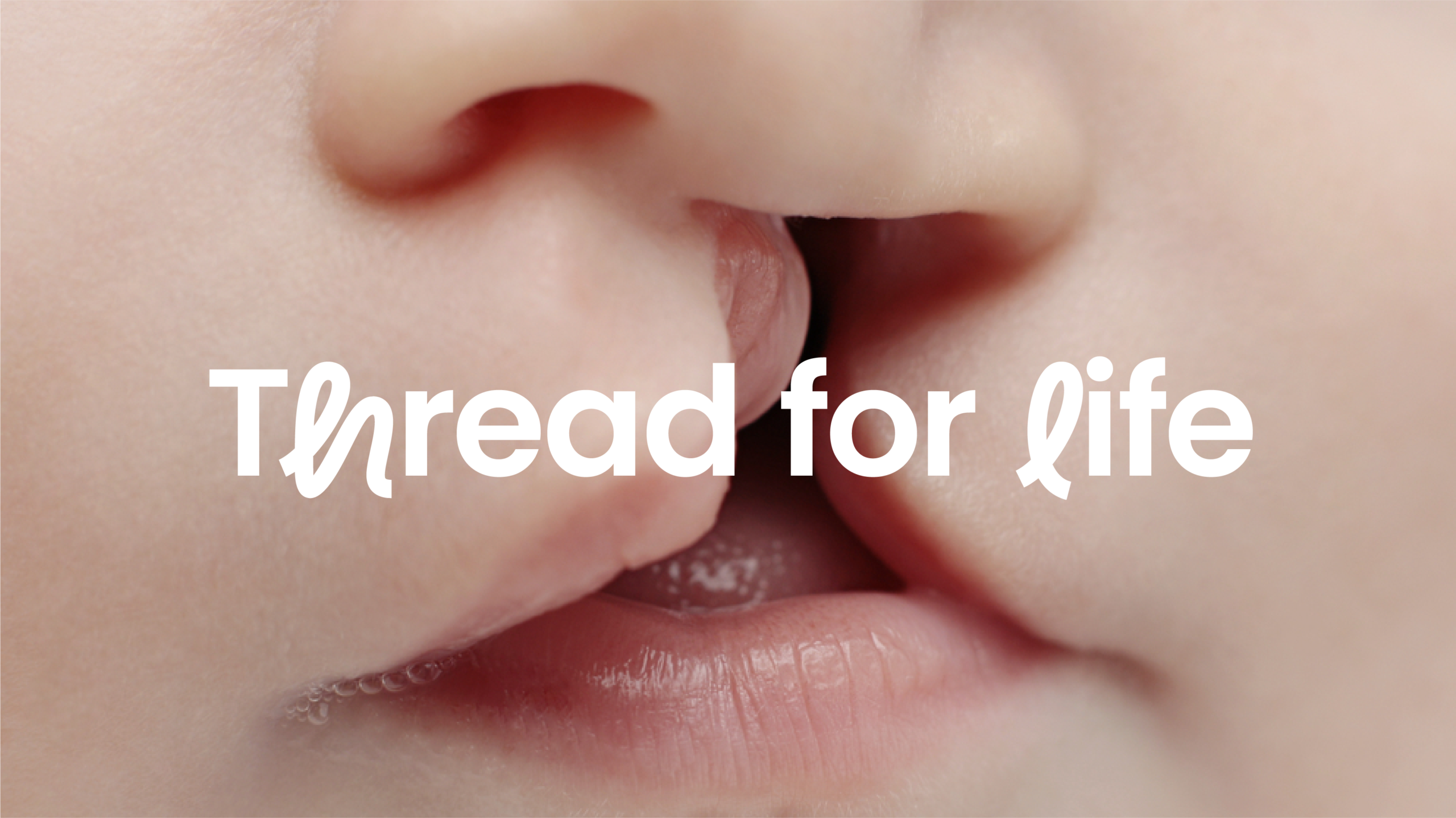
Rightmove finds its happy with a new brand identity
Challenge
Rightmove’s purpose is to empower the UK’s property decisions by helping people ‘find their happy.’
When Rightmove approached us, they had market competition hot on their heels, and their brand had become fragmented across the employee and customer experience, as well as among business-to-business customers (estate agents) and business-to-consumer customers (home searchers).
We were tasked to create a coherent, seamless cross-channel experience. It had to be brilliantly connected, and able to engage all types of customers both online and offline.
Approach
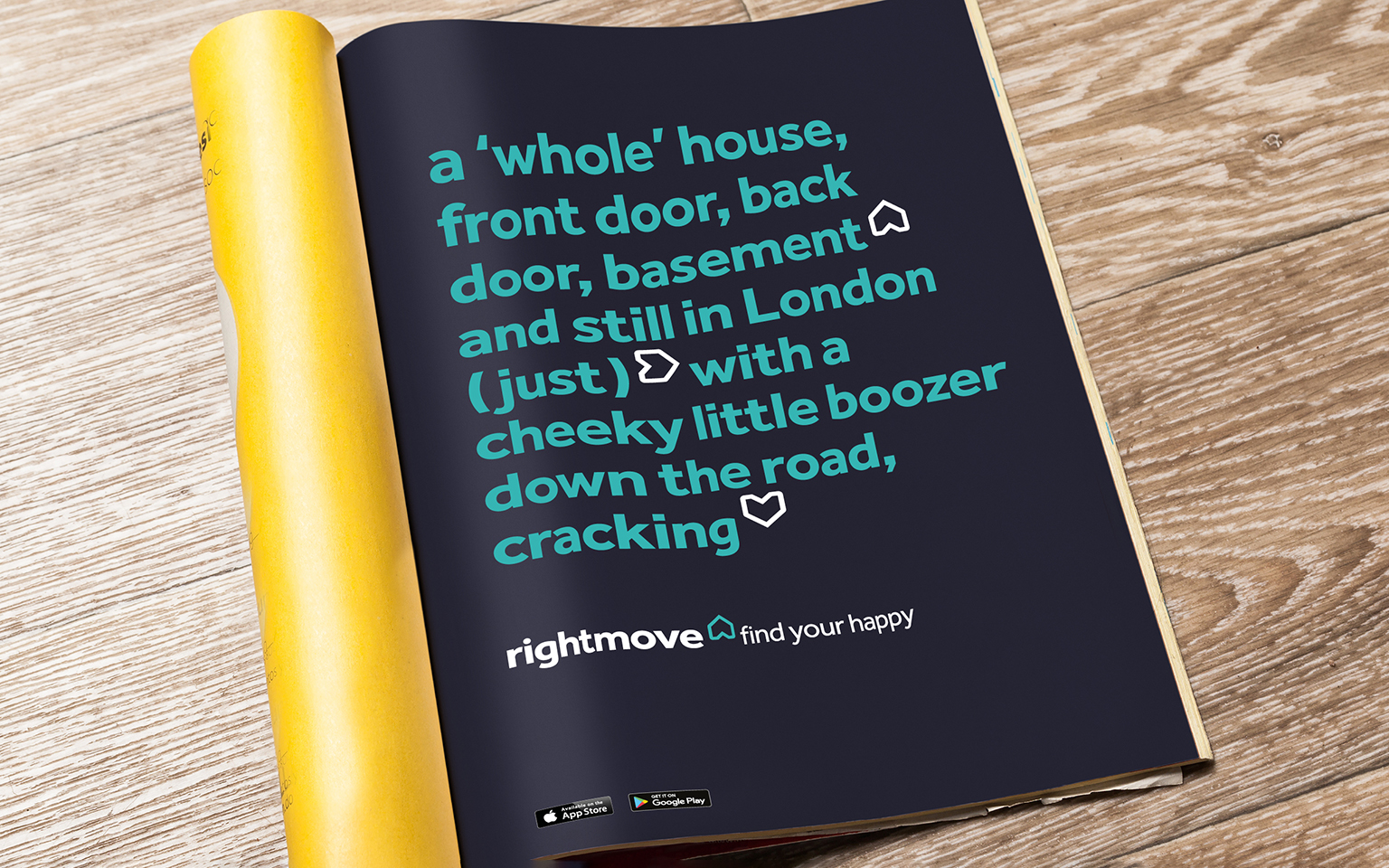
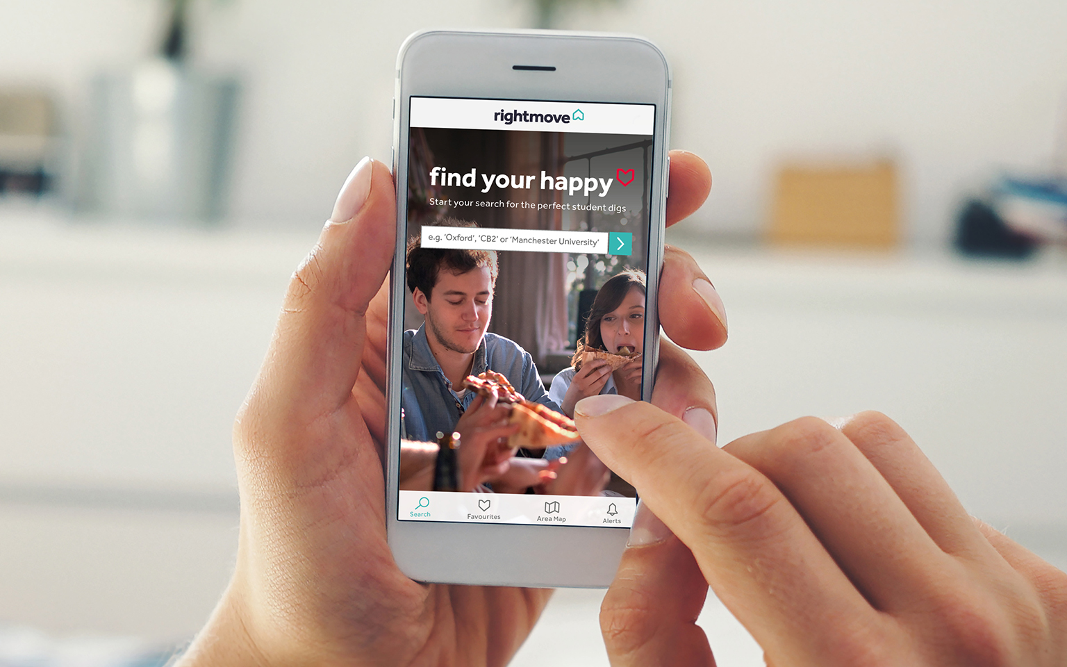
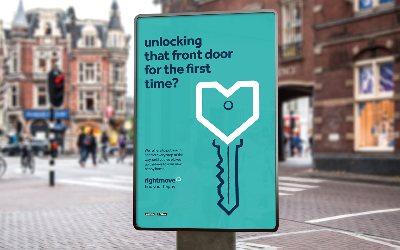
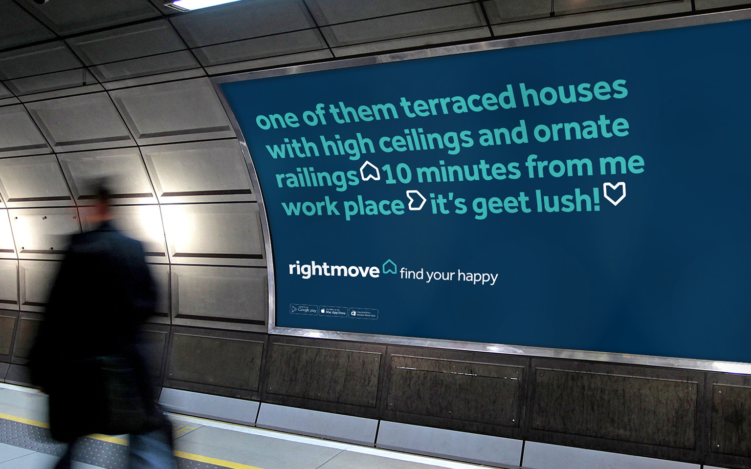
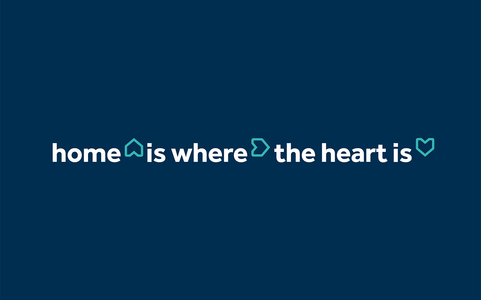
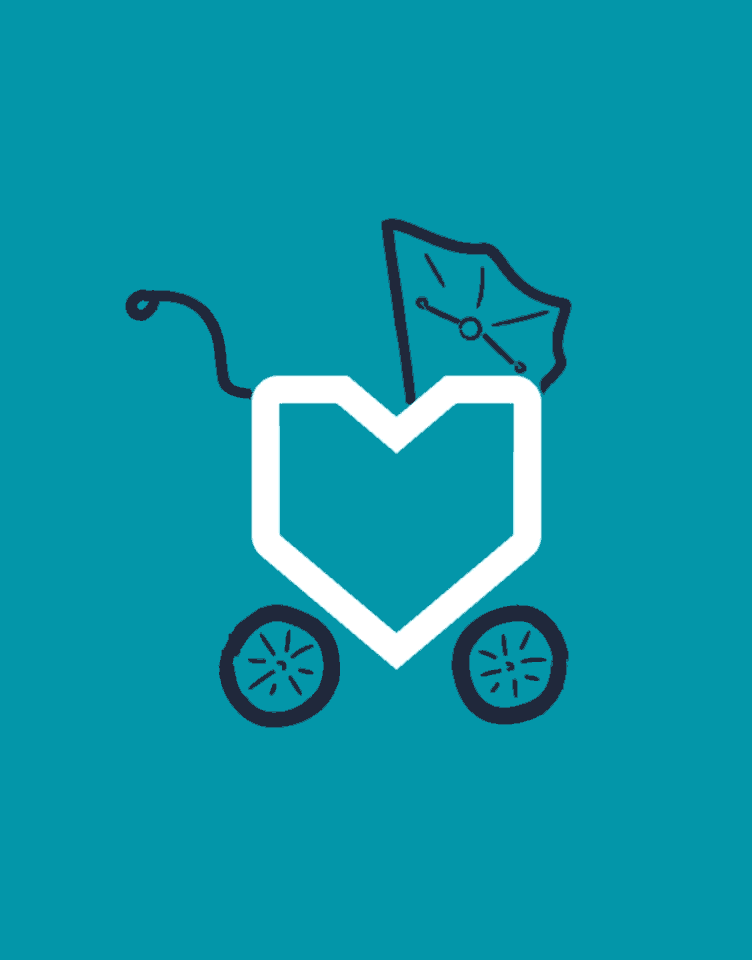
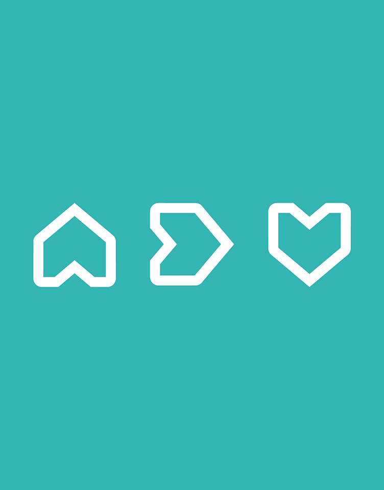
• Our home is central to our happiness, it should be filled with meaningful moments and happy memories. Inspired by the proverb ‘Home is where the heart is’, we needed to create a consistent visual identity.
• The new brand needed to tell the story of finding a happy home in a seamless fashion across all channels, echoing the goals of every Rightmove home searcher and bringing the brand to life.
Strategy
We carried out a brand design sprint – a five-day intensive process where experts from The Team came together to identify the requirements of the brief and understand the needs and opportunities of the brand.
Once the brand design sprint was complete, we tested it using a team lab, where we were able to design, prototype and test ideas for the new brand identity, quickly exploring their viability before creating a final prototype guidance document.
Work
We worked with Rightmove’s senior leadership to agree a new brand strategy, defining a new Brand Purpose (Empowering the UK’s Property Decisions), Customer Proposition (Find Your Happy), and Personality (Friendly Expert, Inspiring, Empowering and Charming).
This reflected the market opportunity for more emotive brand positioning, and was brought to life through a new visual identity, user experience design and tone of voice.
We took the original logo and evolved it for the digital world. We injected human warmth and charm into the existing brand to ensure continued success, and tidied up their brand architecture, sweeping away unnecessary sub-brands to create a stronger master brand.
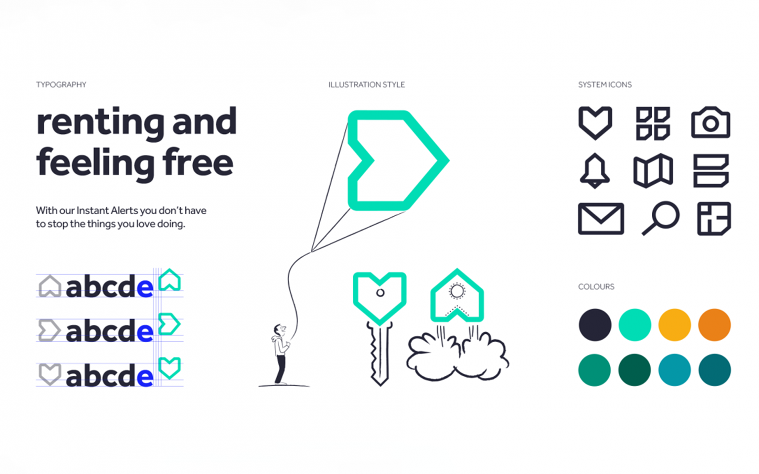
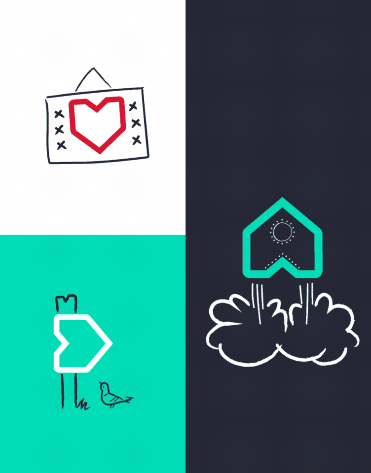
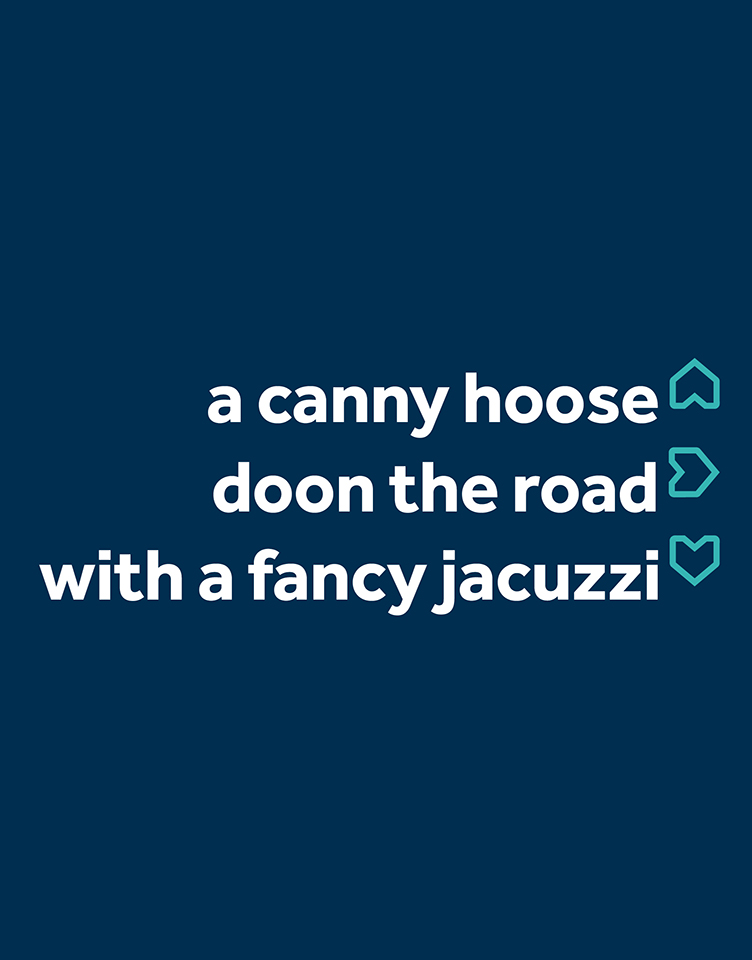
With a new tone of voice, expressive doodles, colour palette, font and photography, the brand has become inspiring, empowering and charming, offering a seamless cross-channel experience.
Odeya Noble-Bougay, Head of Design at RightmoveFrom start to finish The Team pushed the concept with great enthusiasm, lots of creative juices and attention to detail. It was a pleasure collaborating with them, testing and validating the concept and getting to embrace it and own it.
More Case Studies
IBM Consulting
Repositioning and creating brand value for IBM
CLAPA
Redefining the voice of the UK cleft community