Scope
Putting accessible design at the heart of a new visual identity
Challenge
Scope set out an ambitious new strategy in 2017 to work towards the UK being a country in which disabled people and their families enjoy equality and fairness.
The Team’s brief was to create a new brand that delivered this new corporate strategy and to build better understanding, with a focus on achieving brand clarity.
Approach
• The new brand needed to have inclusivity at its heart, but it was also important for the accessible design to still have a distinctive personality.
• Key to our thinking was market analysis demonstrating that most charity disability brands lead with their care and support provision, rather than social change. There was a market opportunity to stand out as a collaborative social change movement – disabled and non-disabled people working together for everyday equality.
Strategy
Before we started the design element of the rebrand, we worked with Scope to identify their new brand platform. Our early work included a review of Scope’s brand architecture, market analysis and stakeholder interviews.
We kickstarted the design process by holding a workshop with people with various impairments, to understand the barriers they can face when interacting with a brand.
Insight informing our brand recommendations came from sector and organisational insight, which allowed us to develop Scope’s brand on a page – identifying their vision, mission, personality, and values, as well as supporting propositions and a strapline. This insight informed Scope’s visual identity, which champions accessible design at every opportunity and follows best practice accessibility standards.
Work
Scope’s new personality – Disability Gamechanger – and organisational values of Pioneering, Open, Courageous, Fair and Connected, fed into every design decision made during the visual identity development. We were working to deliver a truly game-changing brand for the sector.
The visual identity was created in collaboration with Scope’s internal design team during a two-week design sprint, where we co-created the elements that make up the new visual identity and applied them to key channels.
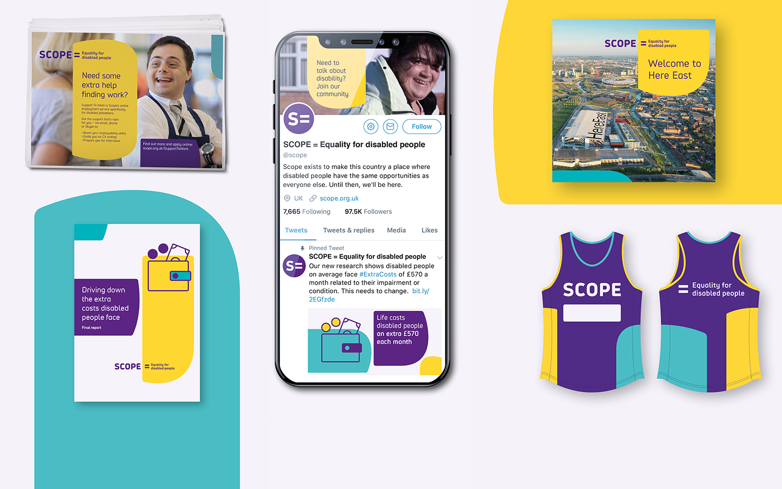
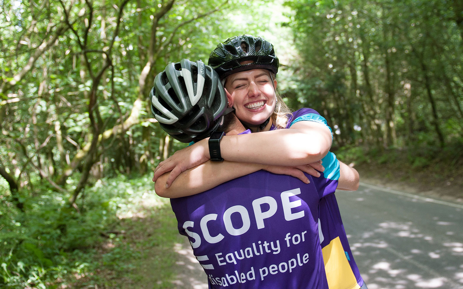
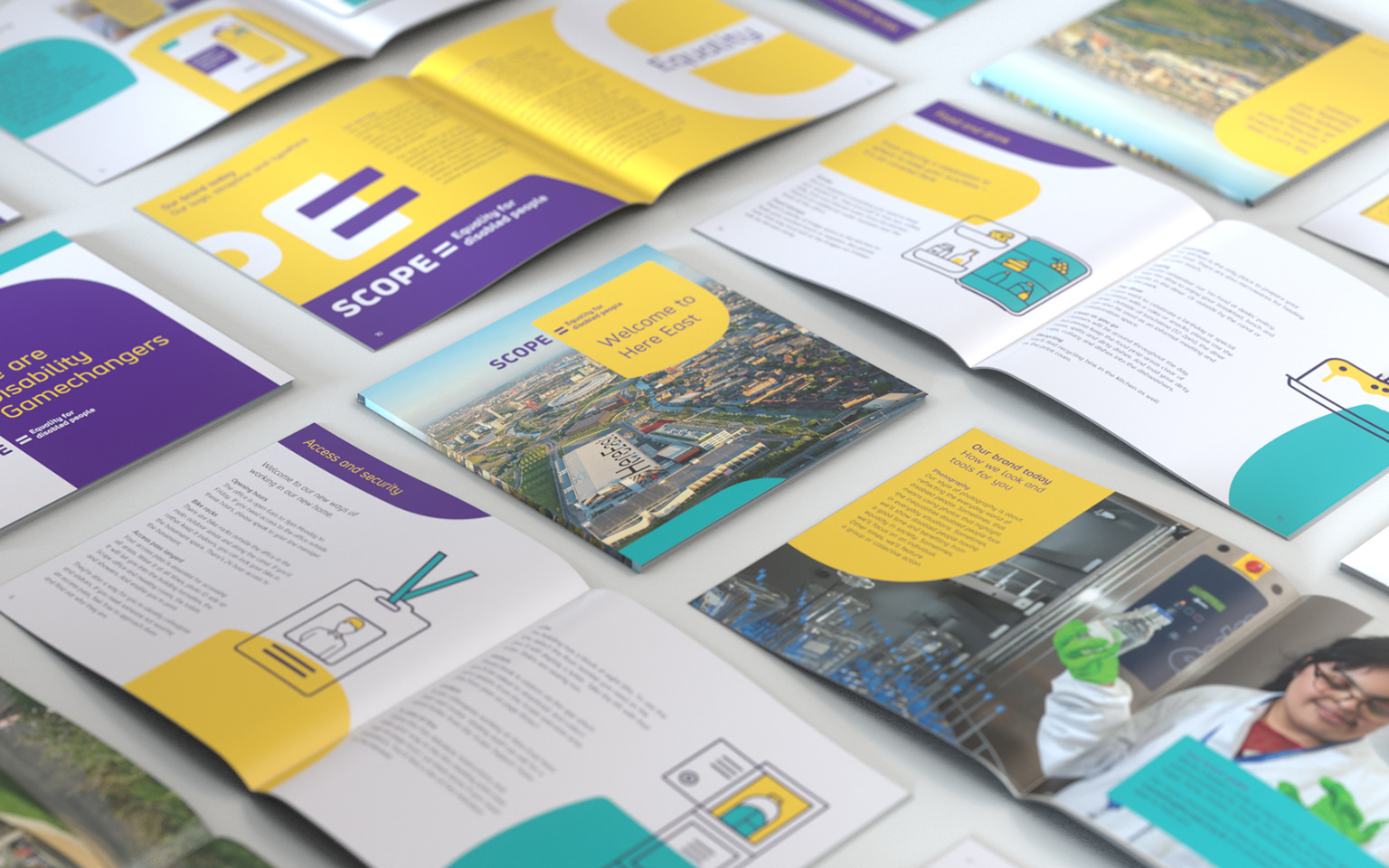
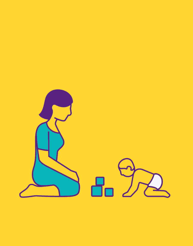
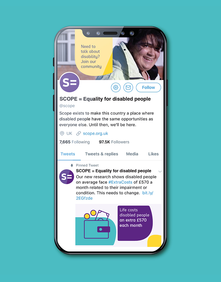
The new brand includes a bespoke font, Hargreaves, which maximises legibility and readability. An accessible and complementary colour palette sits alongside the primary brand colour purple, with a graphic device inspired by the shapes in the typeface to aid navigation and messaging.


Better representation
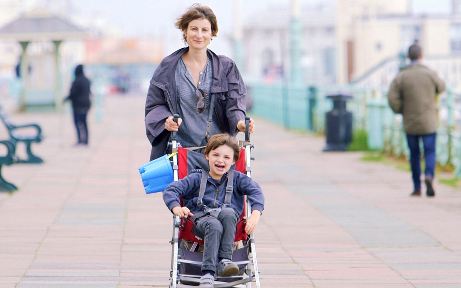
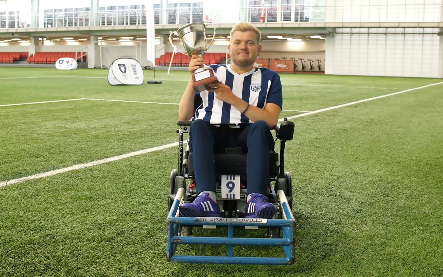
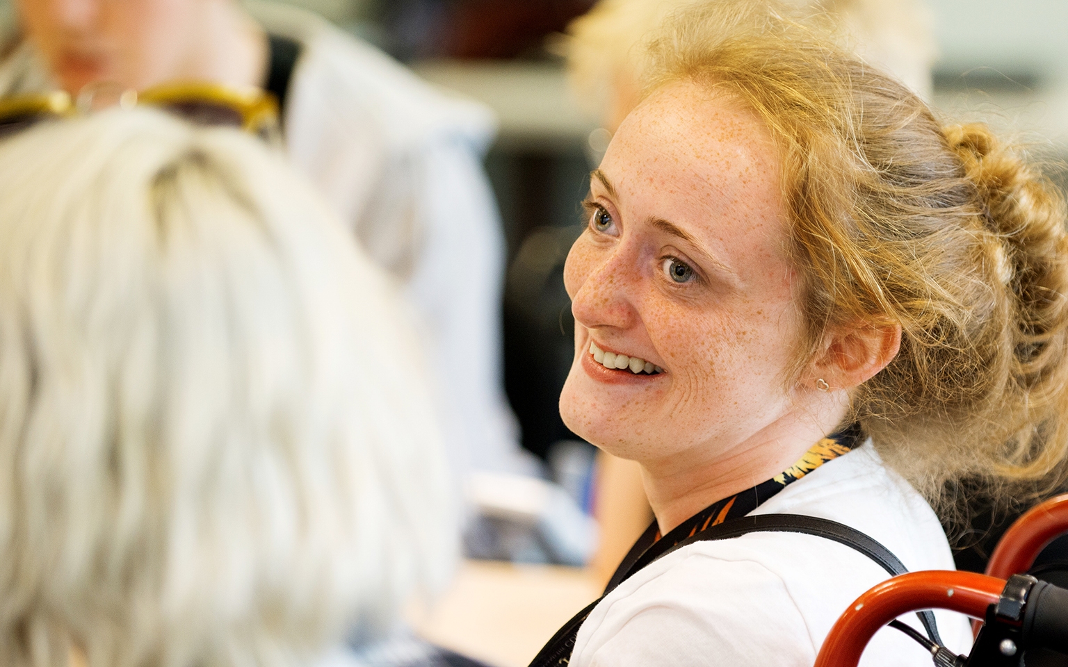
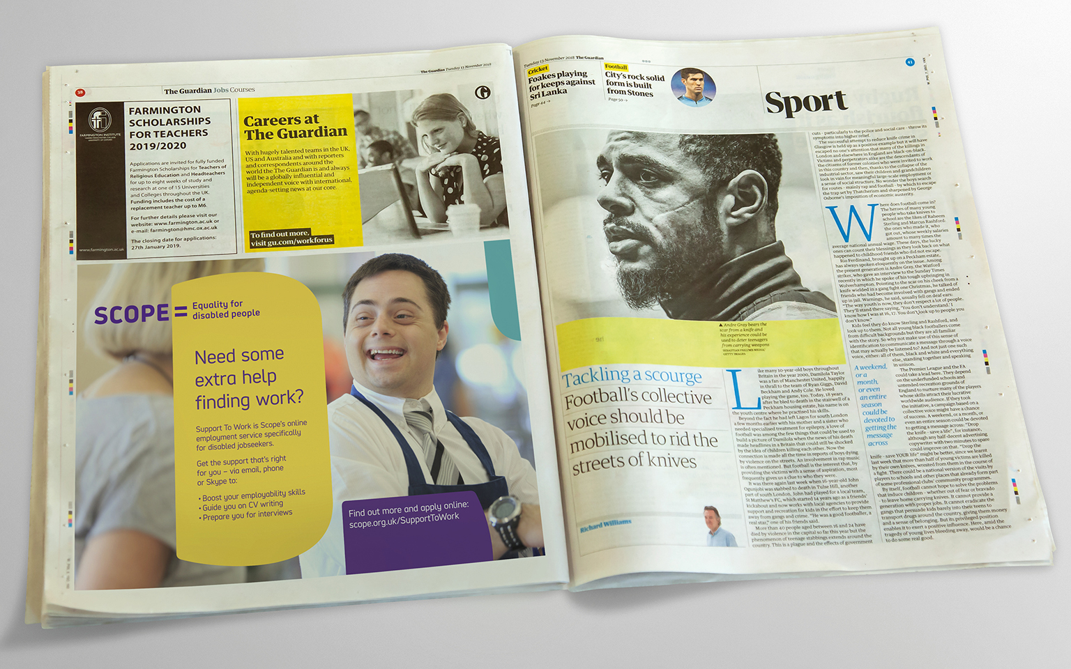
We chose an illustration and photography style to promote disability representation, showcasing real-life stories and sharing relatable moments. The new journalistic approach shows what disability inequality looks like and demonstrates Scope’s work in action.
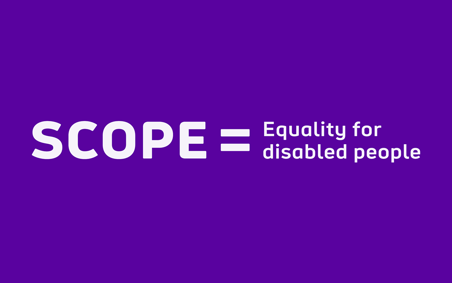
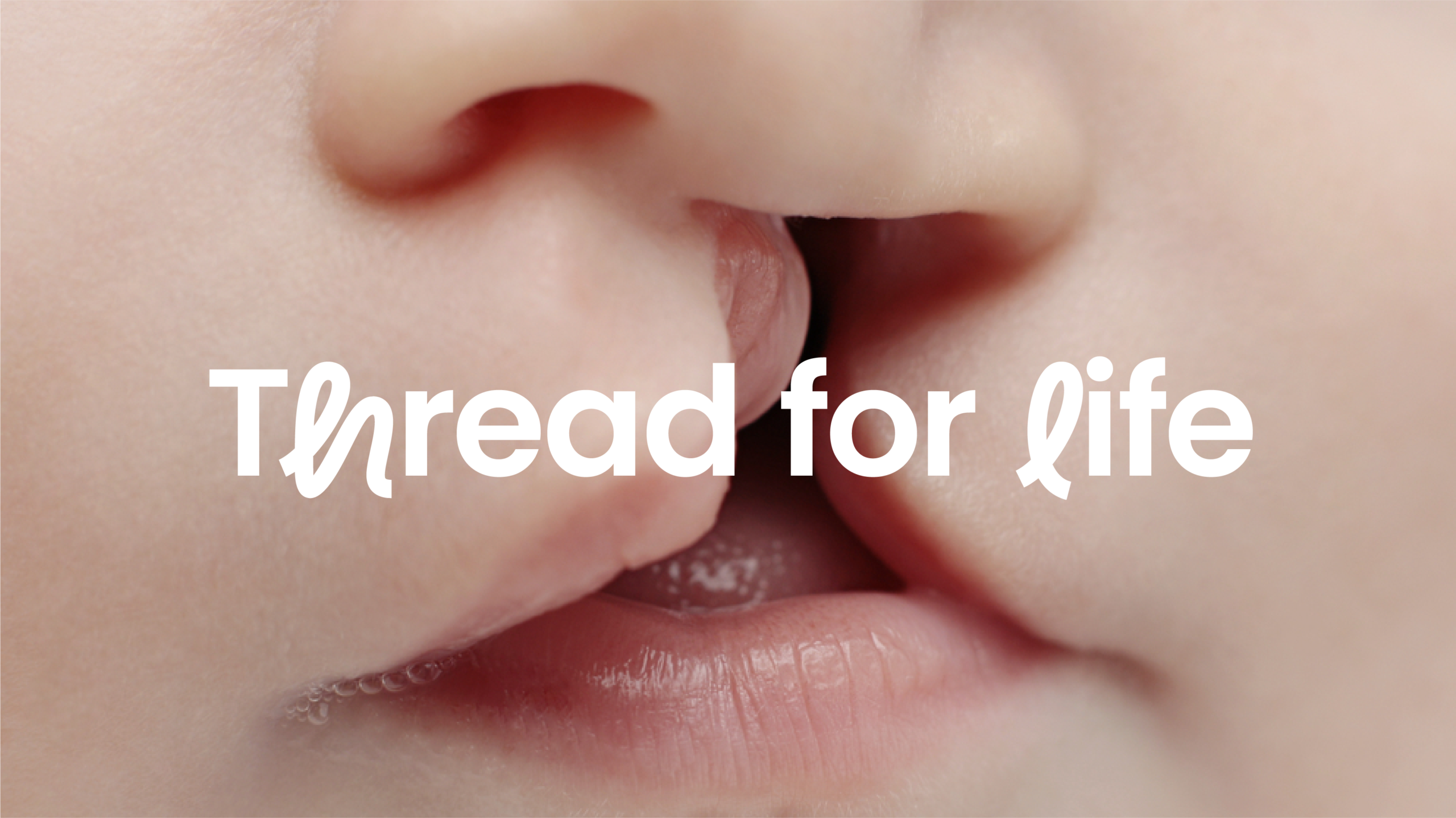
A new logo and strapline embody Scope’s ambition to inspire a social movement to end disability equality.
Scope’s new brand was launched in summer 2018 via their 5-week Disability Gamechanger campaign which aimed to mobilise a community of disabled and non-disabled people towards a shared vision of equality for disabled people.
Awards
Third Sector Excellence Awards Winner, 2019
Brand Development
Outcomes
Danielle Wootton, Head of Brand and Marketing at ScopeWorking with The Team on our brand overhaul has been a huge success for Scope and a pleasure in the process too. Their quick understanding of our unique brand challenges was impressive from the offset. The commitment and talent across all teams (brand strategy, creative, account management) is felt at all stages of a project and delivers results. Thanks to The Team we have a truly game-changing brand for our sector.
More Case Studies
IBM Consulting
Repositioning and creating brand value for IBM
CLAPA
Redefining the voice of the UK cleft community