Illustration that connects and reflects society

Illustration is a powerful tool for bringing different kinds of information to life. Scope’s Junior Designer Lizzie Morgan talks about the collaborative process of developing an illustration style which brings clarity and personality to Scope’s new brand.
Our society is colourful and diverse, not just in culture, but in how we interact and experience the world. Accessible design means you’re considering how everybody can perceive and interact with your brand; including people with different impairments and conditions. This can include sensory impairments, mobility impairments, and learning disabilities. With this in mind, it’s definitely not a barrier for creativity or innovation.
Before we started developing Scope’s new visual identity we held a focus group where we tried, tested, and asked questions about different graphic design and illustration styles among a group of disabled people with a range of different impairments. The session was not only successful for our creative direction but was an excellent insight into how differently an audience can perceive your brand, and in particular illustrations and iconography. We discovered some invaluable insights that helped inform our process including; using commonly used symbols that can be easily recognised rather than unusual, beautiful icons, and the importance of consistent meaning whenever icons and illustrations are used.

Accessibility isn’t just about enabling people to interact with your content, it’s also about making people feel like they’re connected, represented and included. Accessibility in design is the key to making as much impact as possible on your audience.
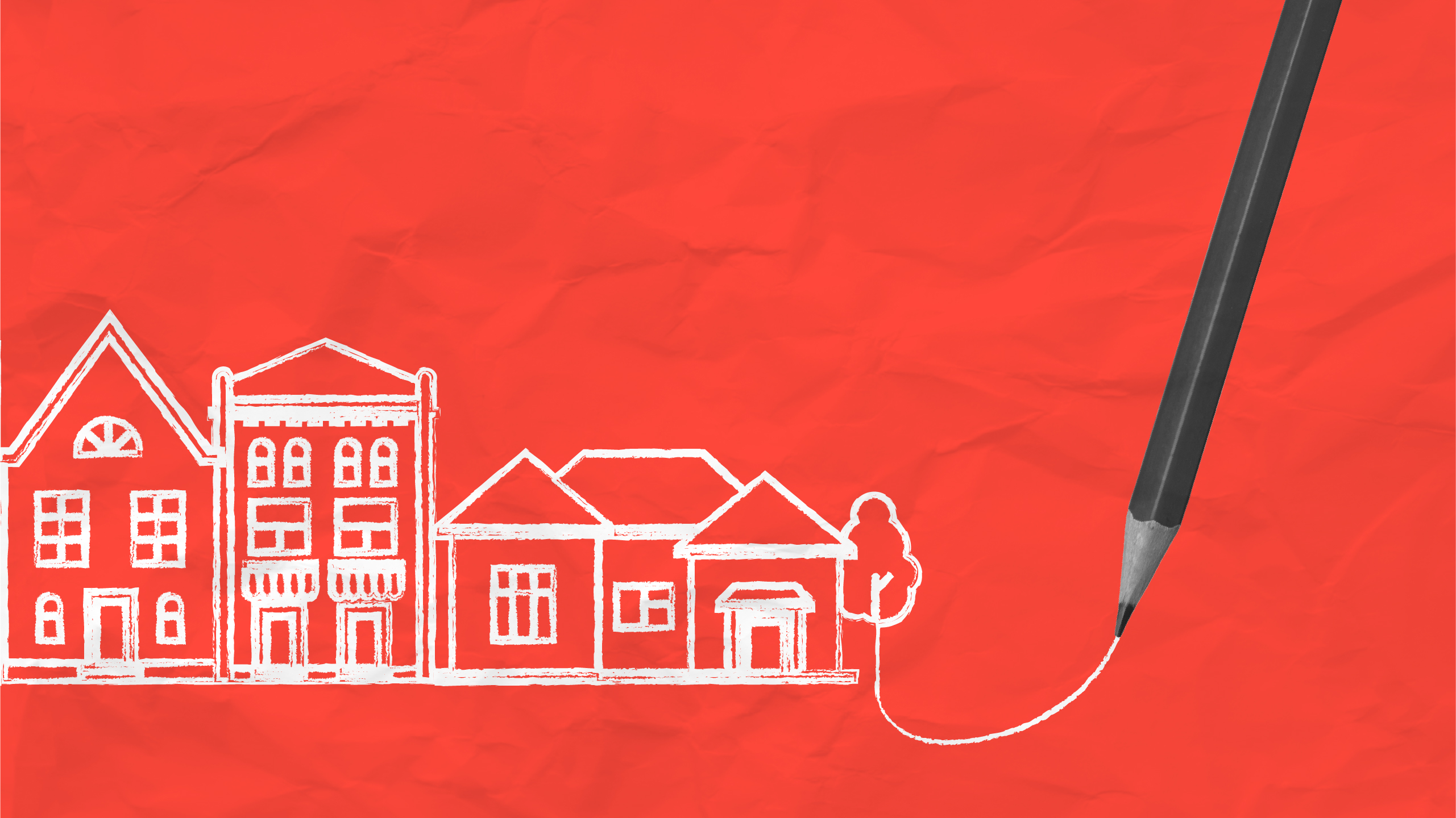
We’ve created a new illustration style that’s not just unique to Scope, but full of meaning and personality. We took our learnings from the focus group and developed a new style that’s creative, unambiguous, inclusive and diverse. Starting with people, we now have an expanding illustration suite of diversified characters; some with visible impairments, different body shapes, ages, fashions and hair styles. We wanted to include those personal elements that make our new style more human and identifiable. In addition to our characters, we’ve created illustrations to convey all areas of people’s lives including employment, education, fundraising, and beyond! All of these bring Scope’s new brand identity to life and help engage our audience on a personal level.

As we’ve been rolling out our new brand identity, we’ve already began to put our new illustration style into action. So far, it’s been used across Scope’s very first dedicated furniture and electrical store in Northampton, and many of our printed materials, as well as internally at our brand-new head office at Here East. It has also helped bring to life stats and research as part of our Disability Gamechanger campaign. It’s already proving to be a flexible style that’s not just engaging to look at but also enjoyable to work with – we’re looking forward to seeing what we can do next!
Download our inclusive design poster – designing with accessibility in mind