To Rebrand or Refresh? That is the question.

What’s the difference between a rebrand and a brand refresh?
In this blog, we’ll help you decide whether you need revolution or evolution…
The dictionary definition of a ‘rebrand’ is to change the corporate image of a company or organisation. But many people still equate a brand with just a name and logo.
A brand is made up of many elements that can all be reviewed and changed to varying degrees, with or without changing the name and logo.
Strategy first…
The foundations of a strong brand are a clear articulation of what it stands for, this is usually referred to as a brand strategy or brand positioning :
- Why you exist
- What you deliver
- How you do it
- Your purpose
- Your proposition
- Your personality.
These are often reviewed when there is a change of strategic direction, such as a new corporate strategy or chief executive, mergers, or acquisitions. There is also a current trend for brands to review why they exist and the value they create for society beyond profit in the era of Brand Purpose.
As Robert Jones says in A very short introduction to branding: “Workers today tend to want to make a difference to the wider world, rather than just win a corporate battle, so purpose statements try to answer the more worthwhile question ‘why do we exist’.
Here, branding clearly extends beyond marketing, and indeed projects like this usually invade the territory of strategy.”
Identity second…
Once the brand strategy and positioning are agreed, it is common practice to review the elements that make up the visual and verbal identity to make sure they can project it.
The brand strategy and positioning form the cornerstone of the creative brief and are used to critique the creative development against, to make sure the brand strategy and creativity work together effectively.
It is best practice to review all the elements that make up your visual identity together, to make sure they reflect the brand positioning and are fit for purpose: Logo, social media icon, typography, colours, photography, illustration, iconography and graphic devises.
It is also now common to do this with digital design and accessibility front of mind.
At the same time, review the elements that make up your verbal identity or tone of voice: name, strapline, brand story and key messaging.
Don’t throw the brand away with the bathwater
There can be a tendency for brand managers to “rebrand and resign”.
New people come into an organisation and like to stamp their mark on the brand. They enjoy the creative side of brand development, but once the new identity has been created, they see their job as being done and move on or up the career ladder.
But embedding and evolving a brand over the long-term is just as important, if not more so. Especially as we are seeing a shift from brand management to brand leadership.
Brand management has a shorter-term perspective and is based on building and measuring image and impact.
Brand leadership has a longer-term strategic perspective, driven by what the brand stands for, and it uses the brand strategy to direct the whole organisation – from employees to products.
This may include ‘brand-driven innovation’, where the brand strategy is used to inspire new ideas and filter out old ones through a clear purpose.
Logo life
It is worth remembering that you can do a lot to refresh a brand without completely changing the logo.
There is a book on my shelf called Logo Life, revealing the life histories of 100 world famous logos, which shows the little steps taken to evolve them over time – from Adidas and BP to Penguin and WWF.
Now that we are amid a Fourth Industrial Revolution, that is changing how we consume brands, we design for digital first.
Therefore, we have seen many brands simplify their logos over recent years by stripping away unnecessary detail to work in smaller online spaces including Twitter, Google, eBay, Microsoft, and Starbucks.
Spot the difference: Rebrand or Refresh?
Whether a project is a rebrand or refresh, is often down to the degree of change.
The degree of change is dependent on the shift in positioning or how much equity there is in the elements that make up the brand expression, which you can establish with a Brand Health Check.
If the name and logo change beyond recognition it is often called a rebrand.
If the name stays the same and there are visual similarities between the logos and identities, it is often called a refresh.
Here are some examples.
If the name and logo change beyond recognition it is often called a rebrand. If the name stays the same and there are visual similarities between the logos and identities, it is often called a refresh. Here are some examples.
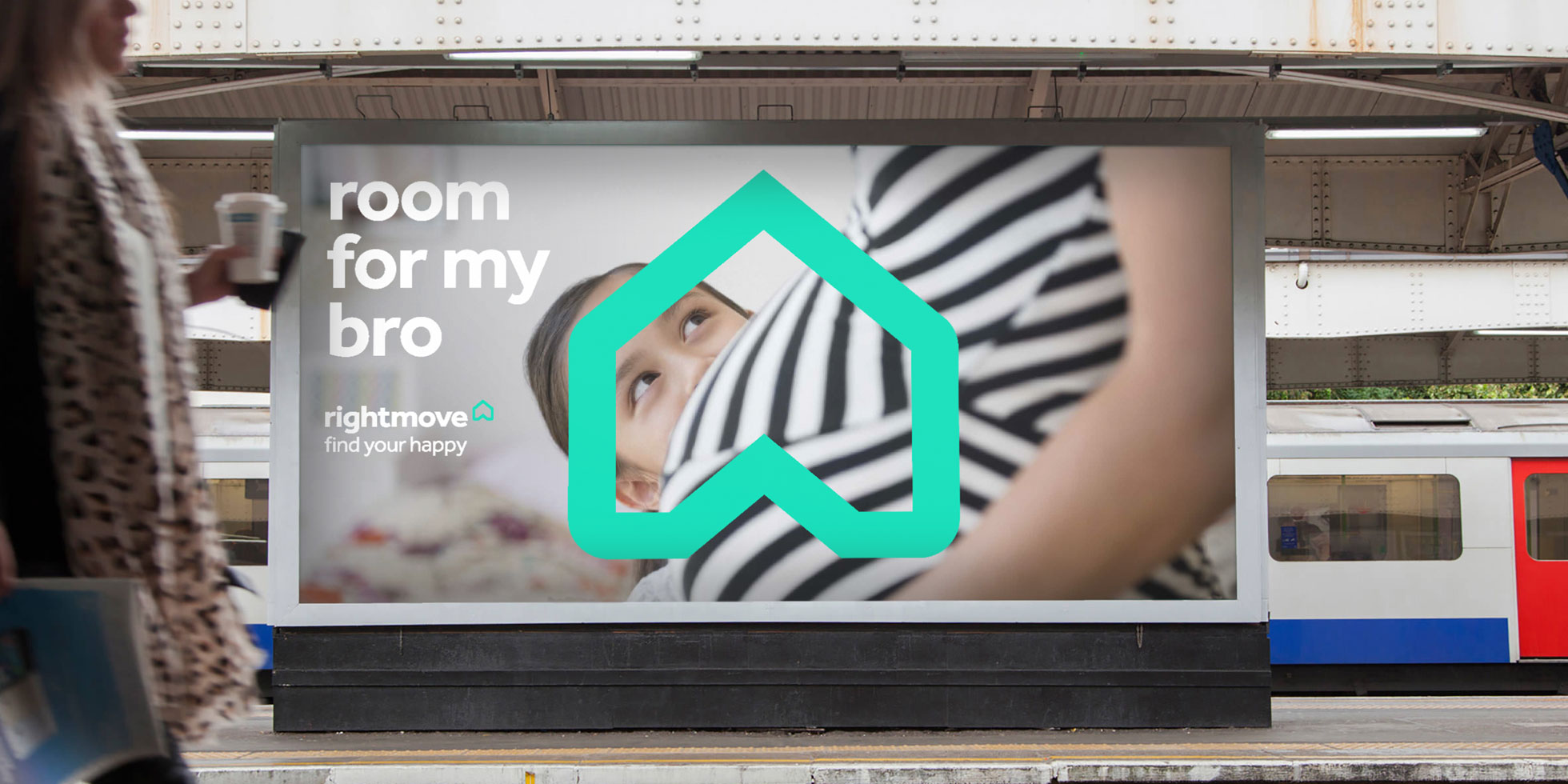
Rightmove: Radical Brand Refresh

Although radical in nature, it can still be described as a refresh. The name remained the same and there are visual consistencies between the logos and their inspiration (an arrow and house).
When Rightmove approached us, they were happy with their proposition (find your happy), but not with the way it was expressed. Its visual identity lacked consistency across on and offline channels.
We polished the brand strategy and positioning, then set to work reviewing the elements that made up the visual identity. This was essential in protecting their position as market leader.
Inspired by the proverb ‘home is where the heart is’, we refreshed their symbol to tell a story and embody the proposition. Its unique shape means it can be rotated from a home into an arrow and a heart.
Effra is the main typeface. Its combination of soft curves and sharp points provide the perfect balance to reflect their ‘friendly expert’ personality.
The icons have the same characteristics as the type and symbol for synergy.
The primary palette is deep blue, with a secondary palette of vibrant accents and mid-tones, including bright teal and cherry red.
Whilst the palette is more contemporary and digital friendly, colours from the existing brand were retained but changed tonally.
Illustrations are an integral part of the brand toolkit. When combined with the symbol, they can visually communicate a variety of messages that add a human touch.
The symbol is always the heart of the illustration. It’s distinctive shape the catalyst for turning it into a multitude of different objects.
Two routes were presented at concept stage, evolution and revolution, with the more revolutionary one taken forward.


Scope: Rebrand

In this case, everything about the brand changed other than the name and the colour purple, making it a rebrand.
The disability charity Scope rebranded in 2018 to become ‘Disability Gamechangers’. All elements of the visual identity were designed and co-created in a Design Sprint with accessibility front of mind.
The brand strategy and positioning were focussed on inspiring a movement to achieve equality for every disabled person.
This in turn inspired the purple equality symbol to represent what they stand for, which comes from the negative space in the ‘e’ from their name.
The new corporate front, Hargreaves, has been designed specifically to maximise legibility and readability. It has multiple accessibility design features, such as a larger letter height and generous spacing between each letter.
There is also no ambiguity between letters and numerals.
The holding shapes, borne out of the letter shapes, are an integral part of the visual identity, they form the backbone for layouts, providing flexibility and versatility.
Their primary function is to hold copy, ensuring messages are always legible and readable.
The simplicity of the line-drawing illustrations filled with the brand colours helps them to be easily understandable and ownable.

Blind Veterans UK: Brand Refresh
This is considered a refresh as the brand elements have been evolved to make them work better and reflect the updated positioning.
St Dunstan’s was founded in 1915 to provide lifelong support to those blinded in the First World War. In 2012 the charity changed its name and rebranded to Blind Veterans UK.
Lost in a sea of red, white, and blue, with mixed messages, The Team were called in to refresh the brand in 2018, exposing the brand truth and creating greater differentiation in the marketplace.
Research showed that members and carers valued the strong sense of community of the brand, whilst potential supporters needed tangible evidence of the life-changing transformation to consider support.
This led us to the personality of Team Transformation.
A refreshed visual identity focused on achieving greater clarity and accessibility.
This included a new headline font, Sharp Sans, created with best practice accessibility principles front of mind.
Shades of teal, mint and grey have been added to the existing red, white, and blue to give stand-out and to make the brand easier to navigate.
The movement of the Union Jack flag within the existing logo has been developed into a graphic device.
This adds energy and momentum to the brand, as well as enabling a graphic system that supports consistency, making the Blind Veterans UK identity more instantly recognisable.


Brain Research UK: rebrand

Brain Research UK is considered a rebrand as the name changed from Brain Research Trust, despite their being similarities between the composition of the new and old logos.
Brain Research UK’s purpose is to fund the best neurological research in the UK to improve people’s quality of life.
We observed that an increasing number of brands in the charity sector are becoming ‘fighting’ in tone, especially the research-based ones, so wanted to take a more optimistic outlook.
Many charity brands also lead with cyan and magenta as their main colourway.
We wanted something with even more impact and have created a multicoloured palette, inspired by a tractograph brain scan by M. Chamberland and M. Descoteaux from the Sherbrooke Connectivity Imaging Lab (SCIL).
Images of brain activity can be awe-inspiring.
Their beauty and complexity are fascinating and make a compelling brand asset.
By overlaying a brain scan on to a photograph we can create a sense of positive energy to provide valuable stand-out.

Can we help you rebrand or refresh?
You may also like
How to plan and activate a brand strategy