Branding Bowel Cancer UK: Action inspiring Hope
Following the merger of Bowel Cancer UK and Beating Bowel Cancer in January 2018, The Team were tasked with creating a brand to stand out in a very crowded and competitive marketplace.
We started by developing a brand strategy for the new charity.
We were immediately struck by how similar many cancer charity brands were. Dominated by blue, purple and pink, with a lot of fighting talk which can detract from a charity’s compassionate side.
We were inspired by the new charity’s determination and positivity. Whilst bowel cancer is the UK’s second biggest cancer killer, it is preventable, treatable and curable, if diagnosed early, offering people affected real hope.
Whilst other brands talked of long-term cure and survival, few spoke with honest human authenticity, so the vision became “Nobody will die of bowel cancer” with a proposition of “Help us stop people dying of bowel cancer”.
We used brand archetypes to help to craft a unique brand personality for the new brand. Some brand attributes are built into the DNA of charity brands. They are what we call ‘hygiene factors’. Charity brands are caring by their very nature and you expect them to be experts in their field, so we had to look beyond the most obvious archetypes such as Carer or Expert.
Heroes of Hope
Drawing inspiration from Challenger Brand narratives, such as the Real and Human Challengers who make human-to-human connections, led us to define the personality ‘Heroes of Hope’. Heroes reflect the values of Action and Community and Hope the values of Hope and Authenticity. The latter two helping us to differentiate the brand from all those fighting by retaining an evocative human touch which runs through the brand.
Action
We are catalysts for positive change. Our role is to inspire more people affected by bowel cancer to come together, collaborate and to take action. Our brand communications have energy and a sense of determination.
Community
People affected by bowel cancer are at the heart of everything we do. Our brand is based on real-life stories. We appeal to people on a more personal level of making a human-to-human connection.
Hope
We provide hope. The best treatment and care for today, to make bowel cancer history in the future. We use everyday words, just like the people we help.
Authenticity
As the UK’s biggest bowel cancer charity, you can expect honesty, integrity and transparency from us. We deal in facts with robust evidence. Our brand reflects the highs and lows of real life.
Beating bowel cancer together
Research showed that Bowel Cancer UK had equity as a name, but we wanted to bring the “UK” to life by showing all the people that make up the bowel cancer community. Patients and families. Doctors and nurses. Scientists and politicians. The brand strapline “Beating bowel cancer together” acknowledges the combining of forces and the contribution made by supporters of the former charity.
Once the brand strategy had been agreed, we created a visual identity and tone of voice in a two-week Design Sprint.
The new logo incorporates the Star of Hope, the international symbol for bowel cancer. It represents community action and hope for the future and is used across the US and in several other countries. The Star of Hope is central to the charity’s identity as it strongly resonates with supporters and patients, who are at the heart of the charity. Some of whom even have a Star of Hope tattoo. The ribbon from the Star of Hope becomes the main graphic device and runs through brand communications with dynamism, reflecting the charity’s energy and determination to inspire positive change. It is hoped that over time the Star of Hope will become as well known as other charity symbols such as Marie Curie’s daffodil campaign or breast cancer’s pink ribbon.
Standing out in a crowded market
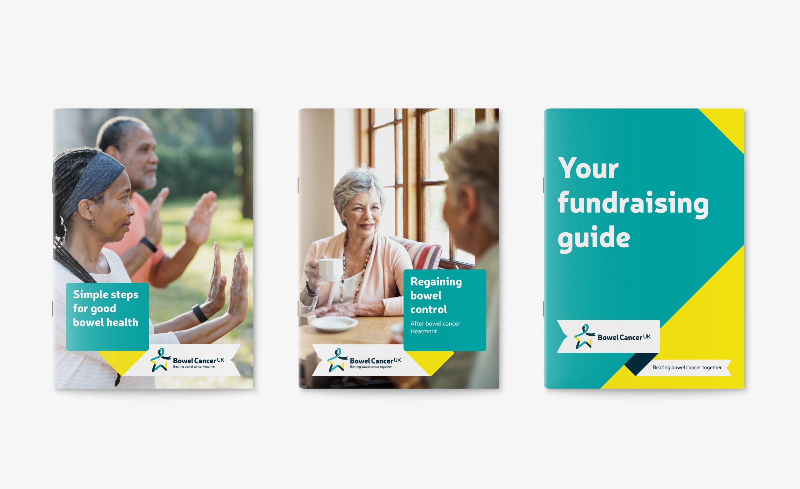
We have consciously moved away from the previous brands colours for greater stand-out, with a new palette of dark teal, bright teal and yellow. Colours that will stand out against other cancer charities and beyond.
Neris was selected as the new typeface to reflect the brand personality and for accessibility. The brand’s new icons and illustrations have been used using the same mix of distinctive curves and corners.

Reportage photography is transparent and authentic, based on real-life stories that appeal to people on a personal level. They capture the highs and lows, documenting people’s active lives in the community as well as their darker days. They also reflect the energy and determination the charity inspires in everyone affected by bowel cancer, capturing people coming together to take action and the difference hope makes to their lives.
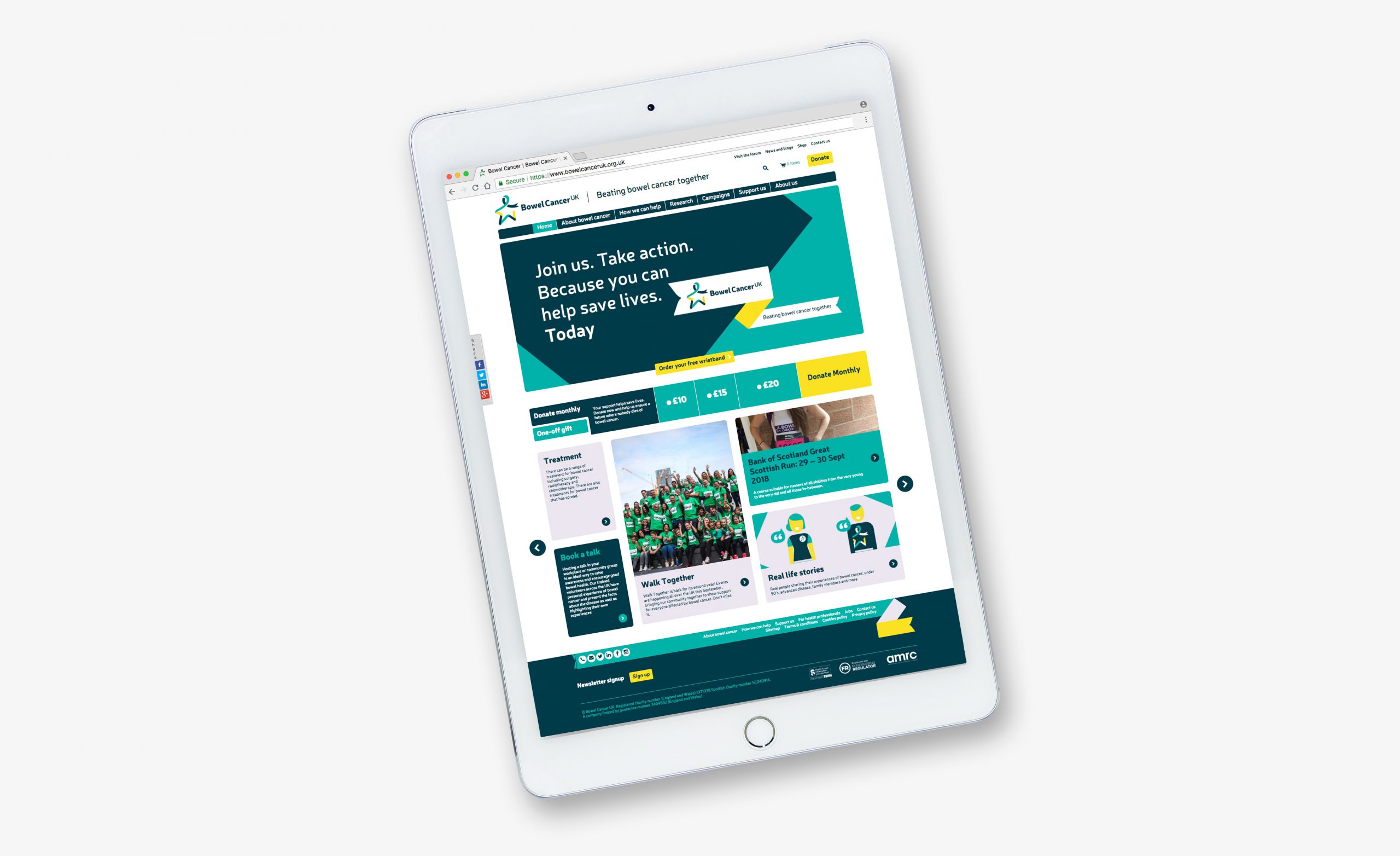
Deborah Alsina MBE, Chief Executive of Bowel Cancer UK, says: “We are delighted to unveil our new brand. We hope this will enable us to build an active community of patients and their families, clinicians, politicians, researchers and others who will join us to ensure that we meet our mission to save lives and improve the quality of life of everyone affected by the disease. Bowel cancer remains the UK’s second biggest cancer killer, claiming over 16,000 lives a year – we are determined to change that.”


