NS&I
A new brand identity and user experience
Challenge
To remain relevant for today and tomorrow’s savers, NS&I needed a digital-first brand identity that was fresh, modern and bought out their unique difference in the market.
We were asked to reimagine the NS&I brand.
We worked collaboratively with their brand team to establish a consistent design language with a modern, dynamic tone and visual identity that worked consistently across all digital touchpoints.
The aim was to humanise the brand and create brilliant experiences for all types of savers.
Approach
• Our first task was to understand the different types of savers and their needs, as well as working to define the essence of the NS&I brand in a compelling and relevant way.
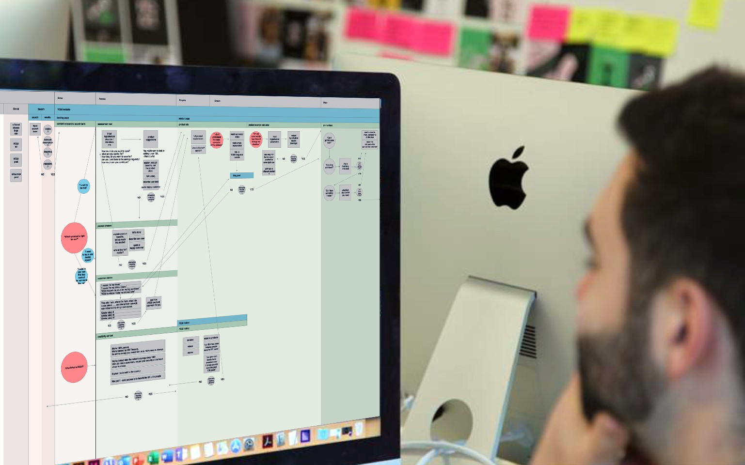
• Then we mapped the existing brand and digital user experience, which was disjointed in places, and needed simplifying to make the user journey more intuitive. We also established design and experience principles for all the different audiences, and for each available product.
• We also reimagined and redesigned NS&I’s brand experience across multiple touchpoints, which varied from a transactional site to the more fun, aspirational Premium Bond prize checking app. So the brand design needed to be flexible to suit the varied tasks and experiences available to all users.
Strategy
Driven by research insight, which included the use of semiotics, we re-defined a unique and compelling brand positioning ‘Where saving begins’ and using universal archetypes, created the personality of the ‘Everyday champion,’ which embodied NS&I’s brand purpose and values.
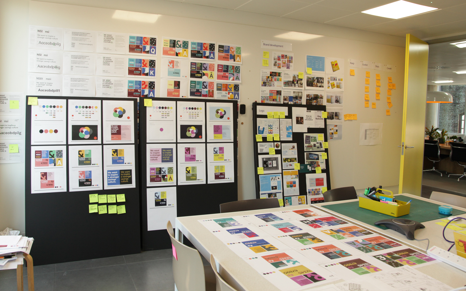
Then using a series of design sprints with client involvement, we developed the brand concept ‘A springboard for saving’ – an energising visual representation of a brand that would inspire everyone to save confidently. The springboard concept was used to shape the letterforms within the logo and typeface. These strategic points were keystone elements that underpinned the subsequent branding work.


In order to deliver the brand online, we mapped the NS&I user requirements across the different touchpoints to understand different needs at different stages. We also prototyped and tested the user journeys on the customer site to define the best content strategy.
To ensure consistency, we set user experience and design principles to give us a global experience language that formed the blueprint for all future design decisions across all NS&I’s digital ecosystem. From there, we worked with development team to design, test and build the customer site.
Work
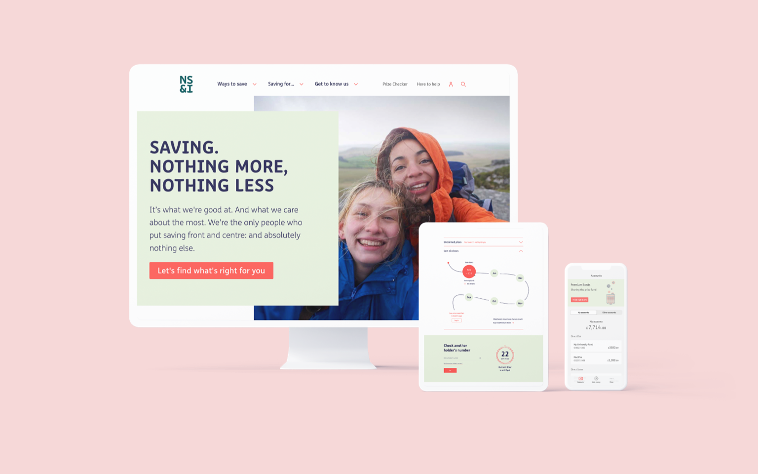
The new brand identity included a new logo, colour palette, imagery, and typeface. At each stage in our process the visual identity was stress-tested across different formats to ensure cohesion across every user touchpoint.
We created a dynamic new mark and visual system based around the springboard concept. The gentle curves add a friendliness to the font and create a springboard effect that stretches across the graphic language.
Creating an emotional arc added flex and direction to the visual and verbal tone, a technique that allowed each piece of communication to be tailored and engaging for the audience and situation.


We created a new graphic language to bring real stories and real customers into communications. This language was then combined with a unique illustration and fresh photography style to create a clear, simple message.
A new transactional app was created to bring the brand to life, presenting account information in a user-friendly and intuitive way to make online banking easy and drive engagement. We worked with NS&I to help design the user experience, then worked with their development partner to build the app.


More Case Studies

IBM Consulting
Repositioning and creating brand value for IBM

CLAPA
Redefining the voice of the UK cleft community