NATS
A new brand identity brings the invisible to life
Challenge
NATS are a global leader in air traffic control – they plot the invisible paths that keep the skies safe. On the ground, they work with airports, airlines and governments to advance aviation.
We were engaged to make the invisible, visible – to bring what they do and who they are to life through their brand. NATS were looking to re-energise their brand in a world where the scope of aviation is becoming increasingly complex, to reaffirm their value to existing customers.
Approach
• NATS’ point of difference lies in its capacity to advance aviation while keeping the skies safe. These two core tenets of their purpose are invisible to the naked eye, so we needed a way to make the invisible, visible.
• We worked with NATS to define a powerful new unifying purpose: ‘advancing aviation, keeping the skies safe’. We then created a comprehensive brand identity to visually express that purpose clearly, coherently and confidently.
Strategy
NATS original brief stated that they required a mission. After discussing their goals, we challenged their brief and concluded that they needed a promise instead – a new unifying purpose that could sit at the core of their business.
Once we had helped them to identify this core value, we carried out a design sprint to build them a modern, comprehensive brand identity.

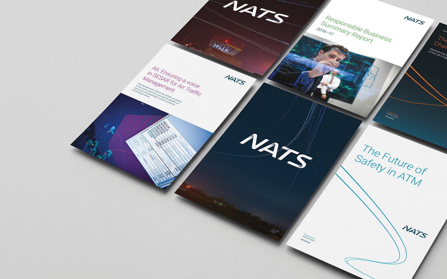
Work
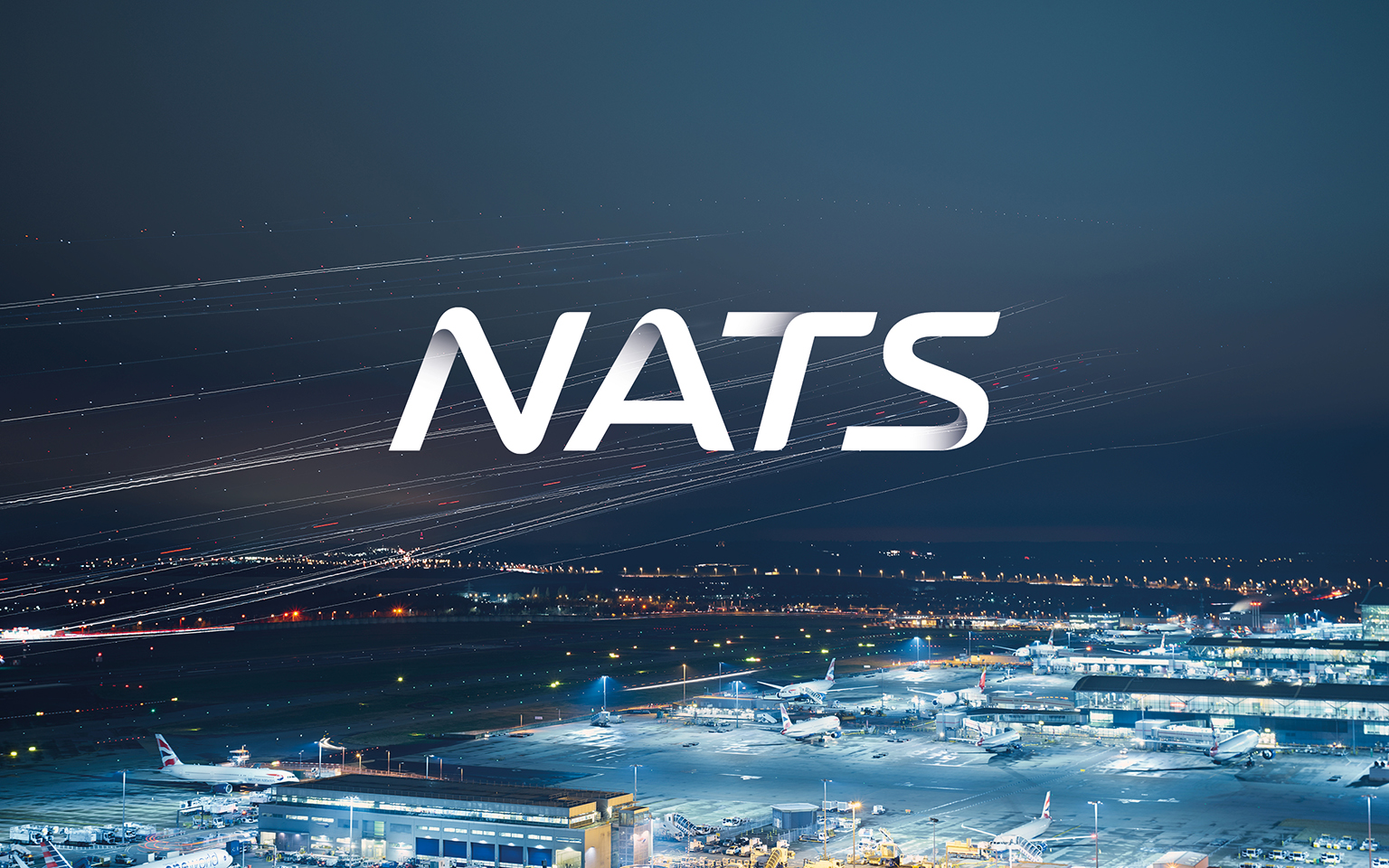
We used long-exposure photography to make the invisible, visible, revealing the highways in the sky and creating a unique, distinctive brand presence for NATS. This thread was then carried through the entire brand identity.
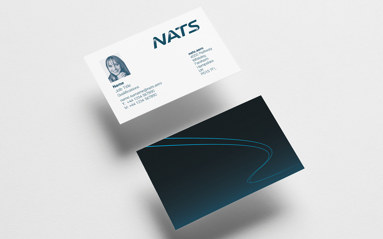
We also carefully crafted a new Flightmark logo to stand as the embodiment of NATS – fluid, distinctive and bold. Informed by this logo are Flight Path graphics and unique signature Skyways photography.
The new brand identity presents a distinguishable face for NATS, acting as an integrated platform for both print and digital channels that combines logo, colour and graphic design to reflect precision and accuracy, transparency and a human connection.
Jonathan Palk, Head of Marketing Communications and Brand at NATSIt’s important for a brand to stay up to date, and it was time to review ours to ensure it mapped to our strategy and represented us correctly. Our refreshed brand is more user friendly in a print environment and also more suitable for use in digital channels – which was not the first consideration when we launched our previous brand seven years ago. From start to finish, The Team pursued perfection to develop a brand and identity system that would accurately reflect the basis of our culture, our actions and our purpose.


Primient
Where science meets nature