Long live logos
We all know that a brand is more than just a logo. But in trying to avoid that common misconception, we don’t often stop to celebrate good logo design.
I may be a Strategist (and a frustrated designer), but I keep two books full of logos close by my side. I often use Logo Life, life histories of 100 famous logos, to demonstrate to clients that it’s commonplace for logos to evolve over time to keep a brand up to date. And Dynamic Identities, how to create a living brand, to demonstrate that logos can have a life of their own, and in fact should.
Simplification
Now that we’re in the midst of a Fourth Industrial Revolution that is blurring the lines between the physical, digital, and biological spheres and consume brands across multiple platforms, we design for digital first. This is why we’ve seen many brands simplify their logos by stripping away unnecessary detail to work in small spaces including Twitter, Google, eBay and Microsoft, as well as the likes of Starbucks and the recent Premier League refresh by Design Studio.
However, just because a logo has to be effective in small sizes and on screen, it doesn’t mean they all have to become dull and flat.
More than one form
Google is always a great example. It has its wordmark as its main signature, the multi coloured ‘G’ as the shorthand for small spaces, but still retains the creativity to reinvent their Google doodles on their homepage. A demonstration that in today’s world maybe one logo form is no longer enough.
Dynamic identities
Dynamic identifies, where the once sacred logo can change within set parameters, are now all the rage. Hence why there is a book devoted to them.
Good examples are the City of Melbourne by Landor where the ‘M’ symbol can house any number of different patterns based on a common grid structure; OCAD University (Canada’s largest and oldest educational institute of art and design) where any number of shapes, patterns or images can break out of the window in their logo ; Or US healthcare company Zocdoc by Wolff Olins where the logo is made up of an ever-changing face.
Physicality and movement
One sector where logos have always had a life of their own, and that other sectors can learn from, is broadcasting.
The BBC’s ‘2’ can take on any form whether it’s lit up, in paint, cappuccino foam, with wheels or even fluffy like a bunny. Whilst Channel 4’s mark is broken down into constituent parts (the nine blocks) to create graphics, typography and idents ; elements that balance the need for enough consistency to be instantly recognisable with enough flexibility for ongoing creativity brilliantly.
Or draw inspiration from down under from the beauty of the motion identity from the Sydney Opera House by Andrew van der Westhuyzen , or the playful and inflatable Darling Harbour logotype.
Positioning
Of course, it’s not just the logo itself but where you put it. Who says we have to limit ourselves to the top left corner online and bottom right in print. I’ve seen some great creativity in the Arts here with Sadler’s Wells by Red&White being bold enough to place their logo front and centre over images, and Royal Court’s created by Lovers cutting theirs in half and running it off the edge of the page.
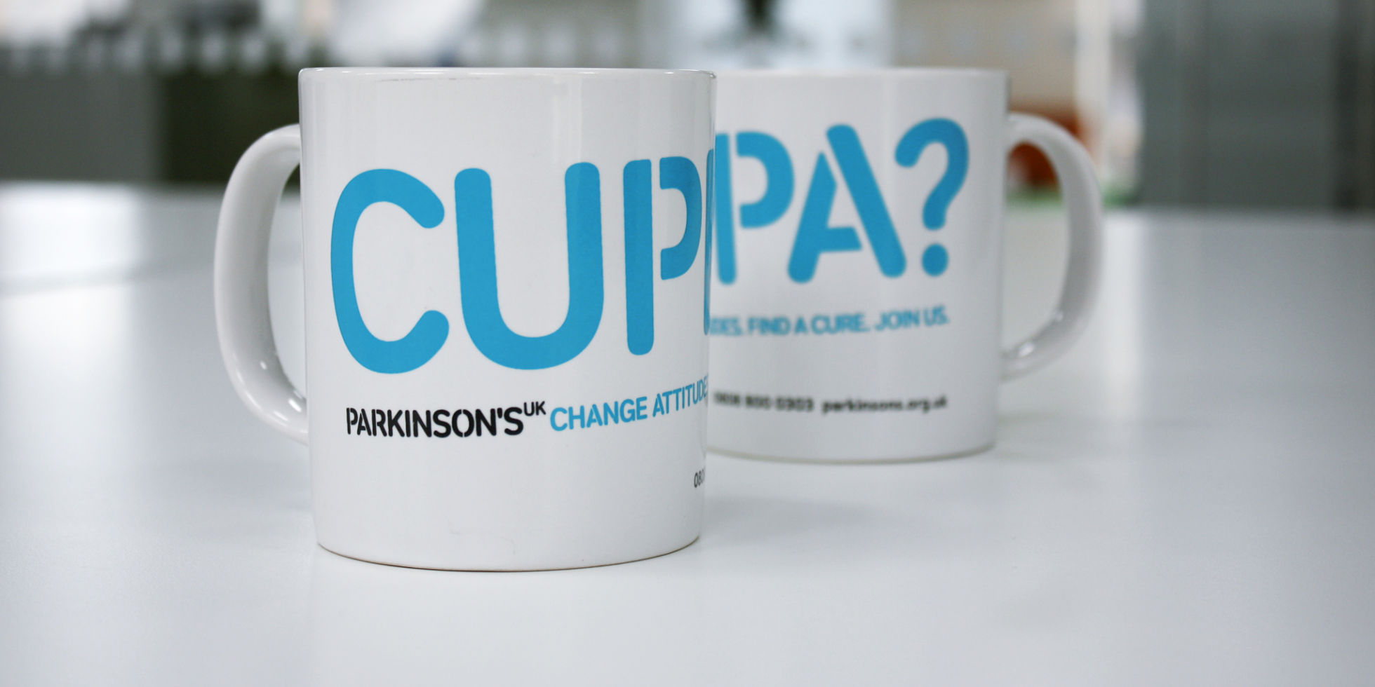
Let me also plug our own work for Parkinson’s UK with a stacked and long logo, which can strike across a page or wrap around a mug. It’s been created by a unique stencil typeface to give individuals the means to communicate what it’s really like to live with Parkinson’s, turning the brand into a movement that everyone can be part of.
Symbols of change
As good old Brand Gap says “Good strategy with poor design is like a Ferrari with flat tyres”. But there is no point creating a design without a strategy to define its meaning and personality first.
For me, it is still important what the logo represents. As I still believe in logos’ ability to be signifiers of meaning and symbols of change.
When I think of Disney I think of magic. The Nike swoosh signifies determination; Red Bull adrenalin; Lego creativity; Tom Ford, luxury; Dove, real beauty; Airbnb, belonging anywhere (ideally Beyonce’s $10,000 per night Super Bowl hang out).
In 1921 poppies were first adopted as a symbol of remembrance for example, much like the red ribbon for World Aids Day and Marie Curie Daffodil Appeal amongst others.
Even the logos of multinational consumer goods companies like Unilever can have meaning. Now that their business is built on brands with purpose – products that make a difference to consumers and to the world – their corporate brand increasingly signifies a leading responsible and sustainable business when used as an endorsement.
So when it comes to logo design – define the meaning then let it live.